
Double Exposure
|
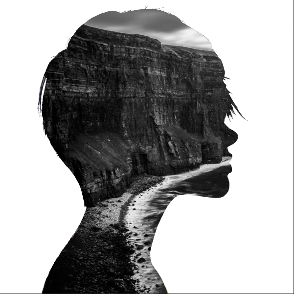
For this project I used Adobe Photoshop. First I found a black and white landscape that I thought was pretty on google images. Then I looked for a profile of a woman. Then after putting them into photoshop I erased the woman and adjusted the background to my liking. I also know that I didn't do this assignment right, but I'm not re-doing it. I like the way this came out.
|
Redesign A Package
|
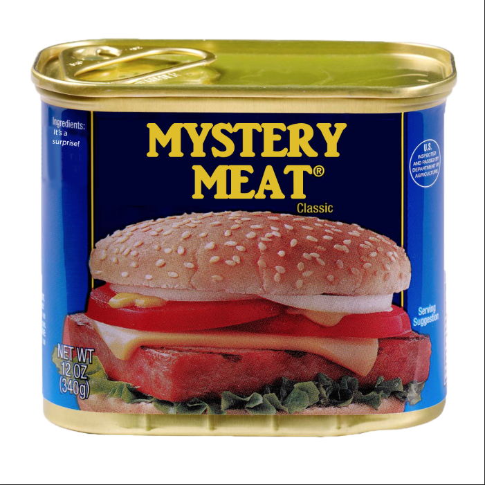
For this project I used Adobe Photoshop. First I had to think of a product I wanted to use and I decided on disgusting SPAM. Next I thought of something to replace the product name with, and I decided on MYSTERY MEAT because SPAM is super shady. Then I put it in photoshop and put the different words in and adjusted the can so that it looked as much like the original as possible. I'm pretty happy with how this project turned out.
|
Four Instances
|
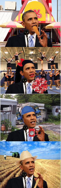
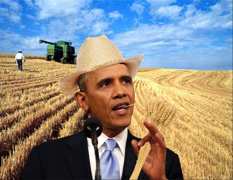
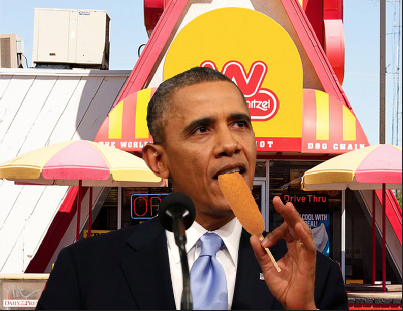
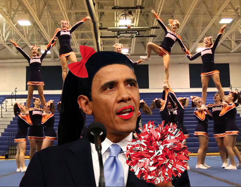
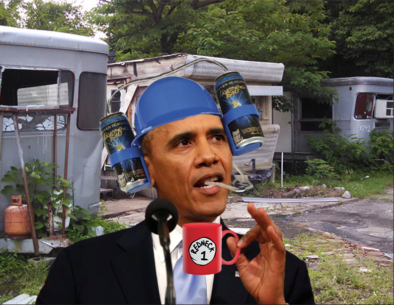
For this assignment I used Adobe Photoshop. First I found a picture that could be easily manipulated of Barack Obama then decided what each of my scenarios would be. Then I generally added something to his hand that he was 'holding'. After that I generally put something on his head-weird hats and a celebrity's ponytail- and put a fitting background behind each. I am happy with how these turned out.
|
Skateboard Deck
|
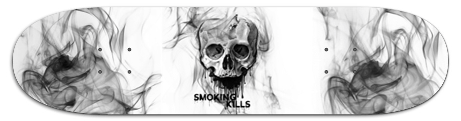
For this skateboard deck I used Adobe Photoshop. First I found a skull online with black dripping from it, then I used the magic wand tool and erased parts of the actual skull so that it looked cool. Then on a layer underneath the skull I used a brush that I downloaded that was supposed to be smoke and put it on different areas of the page. Then I found a font that had drips so that it would match the skull's drips and wrote 'Smoking Kills' and lastly I put it on the template provided. I am very satisfied with the outcome of the skateboard deck.
|
Swim Safety Poster
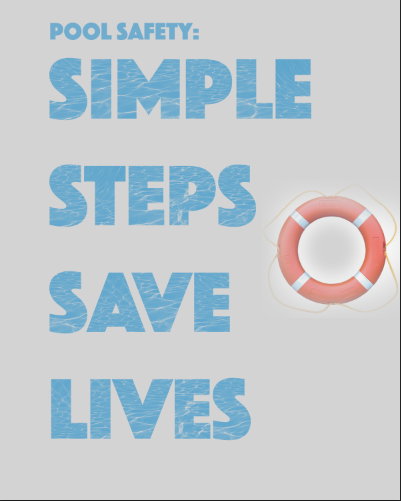
|
For this poster I used Adobe Photoshop. First I looked up pool safety slogans and after awhile of searching I found one that would make the poster pretty easy to make. I did simple steps save lives because it had the word simple so I could technically make the poster super simple because it matched the concept. I found a picture of a pool and made a brush out of the part where the sun was hitting the water. Then I erased the color of the font and used my custom brush to make the words seem like pool water. I am actually satisfied with the outcome of my poster, and yes the background is GREY not ugly tan.
|
Memory Project Portrait
|
|
|
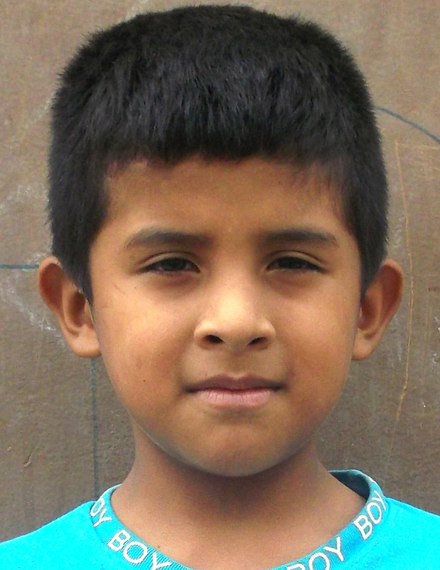
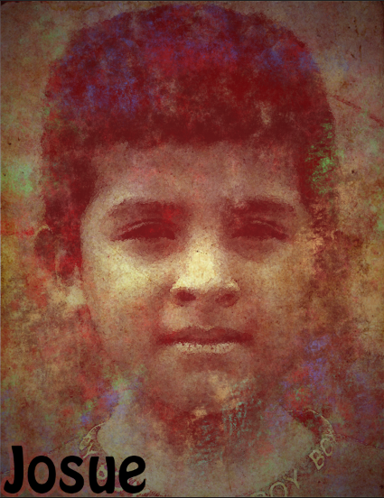
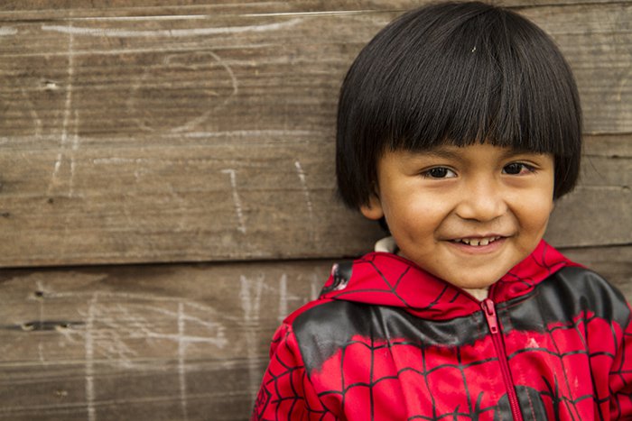
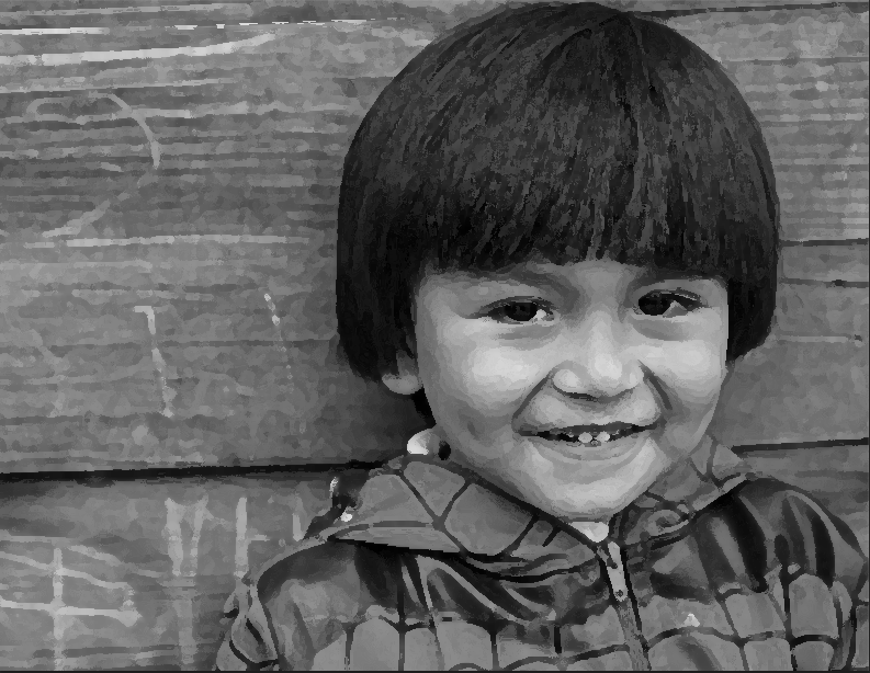
For this Portrait I used Adobe Photoshop. First I had to decide which kid I wanted to do for the portrait and I chose a boy named Josue. Then I browsed the tutorials from the link on the assignment and chose one that looked really cool in the sample photo. Then I followed the instructions given and it was pretty fun to do even though he turned out looking like a spawn of the devil, though it's his fault for having his favorite color red. Overall I'm pretty fine with the outcome of this assignment.
|
Pen Tool Portrait Alt. Assignment
|
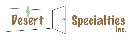
For this logo I used Adobe Illustrator. I sketched out some ideas first and sent them to the owner to see which ones he approved of. Then I used the pen tool and made the door and cactus. Then I found a font that I liked and made it a brown color and typed out the name of the company. I am very satisfied with this logo.
|
Practice Portrait
|
|
|
For this portrait I used Adobe Photoshop. I found a picture online of a little boy who looked like he was from another country and put it in photoshop. Then I turned it black an white and put an easy photoshop filter over it so that it looked like something different from the original picture. Then I took a screen shot and turned it in. I'm not very satisfied with this picture, maybe if I had put more actual effort into it I would be happier with the outcome.
|
Scholarship/Contest Entry
|
For this picture I went outside with one of the cameras. There really was no actual process to making the picture besides finding a bush and zooming in. To turn it in to the entry site I had to write a bunch of weird information about myself and the picture. I'm neutral about this picture because I hate photography so I don't care enough to actually be satisfied or dissatisfied with it.
|
Coffee Shop Interactive Menu
|
For the interactive menu I used Adobe InDesign and made a five page document. I found a fancy font that I thought was pretty and typed out what was in the picture of the menu board. I then made a coffee bean with the pen tool and put it on each page then made the background color a pale yellow. I'm pretty okay with how this turned out.
|
